Siro
.gif)
Process
Siro’s flagship product is a mobile app that leverages AI to record, transcribe, and analyze conversations between field salespeople and their prospects. With nearly 25,000 users, the app plays a crucial role in empowering sales teams in the field.
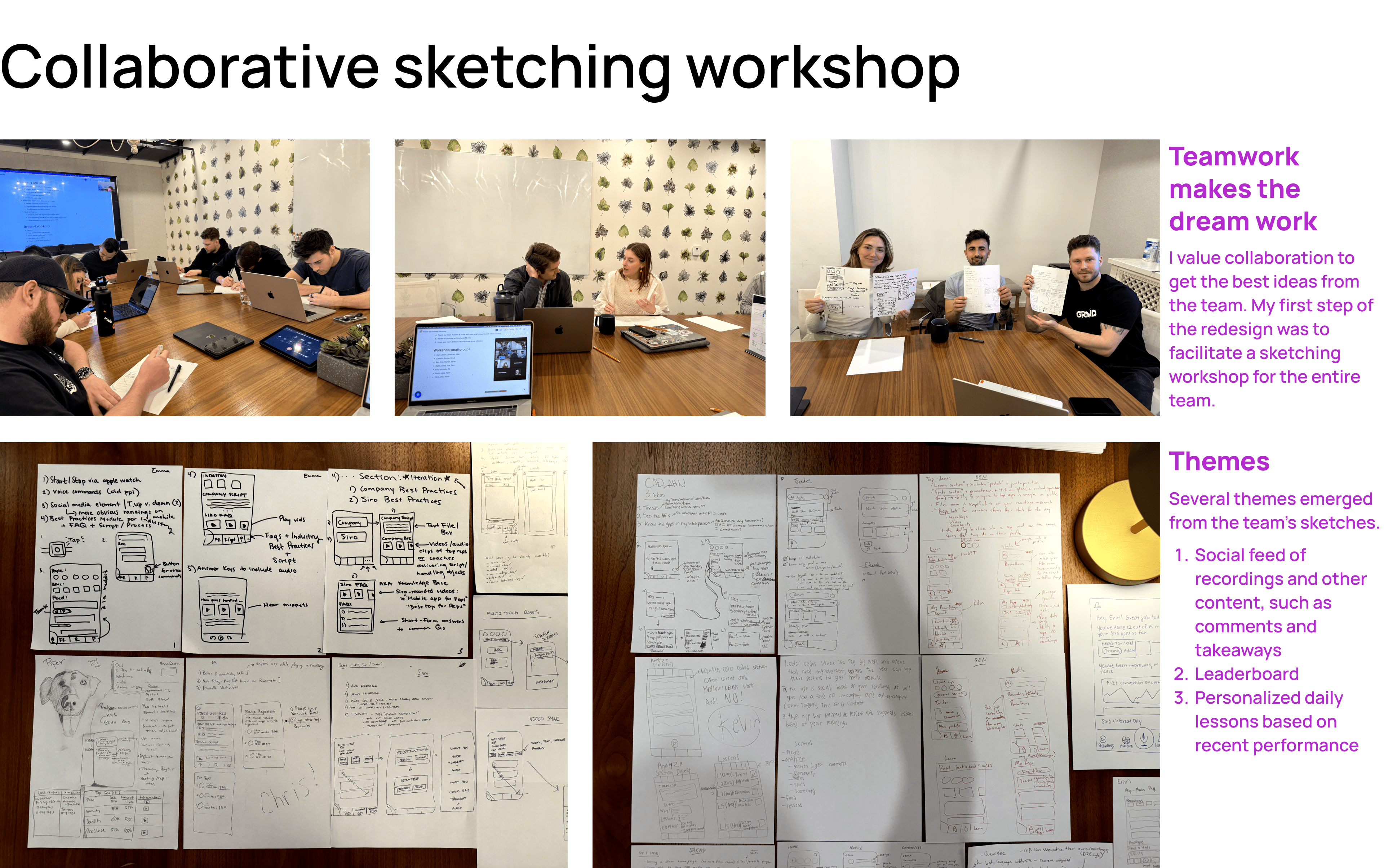
As the sole designer at a startup of 20, I was responsible for both mobile and web products. For this project, I took on dual roles as both Product Manager and designer, collaborating closely with a single mobile engineer.
Field sales encompass any sales activity conducted outside of an office environment, such as door-to-door sales or home remodeling technicians upselling products.
Why a Redesign?
The mobile app hadn’t been updated since its initial creation in 2020. Users frequently reported confusion about basic features, like commenting, leading to a constant stream of customer support inquiries.
Moreover, users weren’t fully capitalizing on the app’s potential. Engagement rates were alarmingly low; after signing up, only 7% of users listened to a recording.
Key Problems Identified
After a thorough review of the app, I pinpointed several critical issues:
- Lack of Value from the Home Page: Users didn’t derive meaningful value from the home screen.
- Feature Discovery Challenges: Users struggled to discover and use key features.
- Overwhelming UI: The interface was cluttered with numerous floating action buttons, leading to user frustration.
- Non-intuitive Navigation: Users found the navigation cumbersome, making it difficult to find what they needed within the app.


Result
The redesign received a 5/5 satisfaction rating from participants in user research, validating the effectiveness of the proposed changes.
Near the end of the project, however, the engineering team had to shift focus to address a surge of critical bugs and improve the app’s technical quality. Consequently, the redesign was deprioritized.